Creating Accessible Microsoft Excel Documents
Make your Excel documents accessible to people with disabilities. Well-structured, accessible spreadsheets are easier for everyone to read, analyze, and maintain.
Microsoft Excel Accessibility Checklist
Workbook Setup
- Make the file name meaningful (e.g., "december_sales.xlsx")
- Rename sheets to describe their content (not "Sheet1", "Sheet2")
- Cell A1 of each sheet should not be empty
Tables
- Organize data into tables. (Ctrl + T) or (Home → Format as Table)
- User column headers in the first row of the table.
- Avoid merged cells.
- Don't use empty cells to create visual spacing between data.
- Leaving a cell empty is an acceptable way to represent no data.
- Don't embed tables within tables
Layout
- Organize content from left to right, top to bottom
- We recommend using one table per sheet instead of using empty rows and columns to add visual spacing between tables.
- Avoid placing unrelated data in different areas of the same sheet
Images & Alt Text
All meaningful images, charts, and graphs, must include descriptive alternative text (alt text) so that a person who uses a screen reader can understand the meaning.
- Right-click (shift + F10) the image → Edit Alt Text
- Describe the purpose of the image, not just what it looks like. Keep descriptions concise. Don't start with "image of" or "photo of".
Example: "Line graph showing a decrease in accessibility issues over the last four quarters"
Color
Consider users who are colorblind.
- Don't use color as the only way to provide information.
- If you highlight rows or columns with color to provide meaning, you must provide that color's meaning another way.
- Add a "status" column with text that describes the meaning of the color. (e.g., "Incomplete" for red rows, "Complete" for green rows)
Contrast
- Text needs sufficient contrast against the cell background color. Aim for a text contrast ratio of at least 4.5:1.
- Parts of graphics required to understand content must have a contrast of at least 3:1 with adjacent colors.
Links
- Link text should clearly describe the destination
- Avoid vague phrases like "click here" or "read more"
- Avoid long, raw URLs
Example: Visit the NCDIT Digital Accessibility website.
Accessibility Checker
Microsoft Excel has a built-in tool to help find accessibility issues.
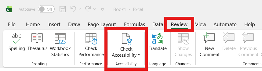
- Go to Review → Check Accessibility
- Review and fix issues
Note: Automated tools catch many issues, but a final manual review is essential.
Export Excel to PDF
- If exporting to PDF, ensure accessibility tags are created
Thank you for making your Word documents accessible to people with disabilities.
For additional guidance, visit Microsoft's Official Excel accessibility support page.